Intruso
Industry
Productivity Technology
Health & Wellness Tech
My Role
Product Designer
UX Researcher
Platform
Mobile App
Timeline
10 weeks
Tools
Figma
What is Intruso?
An AI‑driven task manager that works with the ADHD brain, not against it.
Traditional to‑do apps assume a brain that remembers, prioritizes, and starts on cue. INTRUSO is built for the one that doesn’t — capturing thoughts the moment they arrive by text or voice, then quietly organizing them into a weekly plan
The name "Intruso" comes from the idea of organizing intrusive thoughts, transforming your intrusive thoughts into an organized reality.
Defining the Problem
At the start of the Intruso project, I set out to solve a deeply personal challenge—helping individuals with ADHD transform their intrusive thoughts into structured, actionable tasks.
Traditional task management apps often felt rigid and overwhelming, leaving neurodivergent users frustrated. Intruso was born from my desire to create an intuitive, AI-powered solution tailored to their unique needs.

2. Ideate
Before diving into design, I needed to deeply understand the challenges ADHD users face with productivity and organization. My research phase involved:
1. User Interviews & Research Methods
I conducted extensive one-on-one interviews via phone and face-to-face conversations with ADHD individuals to gain firsthand insights. Additionally, I conducted secondary research and competitive analysis to benchmark existing solutions.

Key Takeaways


📌 Other Key Insights:
Users want an organizational tool, not an overwhelming motivational app.
They need structure without feeling controlled or micromanaged.
The app must blend seamlessly into daily life without demanding too much attention.
2. User Persona
Using the interview insights, I created an affinity map to identify recurring themes. This helped me craft user personas.

“As someone with ADHD, I just want a system that doesn’t make me feel guilty for forgetting things. I need something that works with how my brain functions—something flexible, visual, and low-pressure, so I don’t feel overwhelmed every time I open it.”
— Micha, 34 y.o3. Competitor Analysis
Additionally, I conducted secondary research and a detailed competitor analysis, focusing specifically on apps designed for ADHD, not just general task management tools.
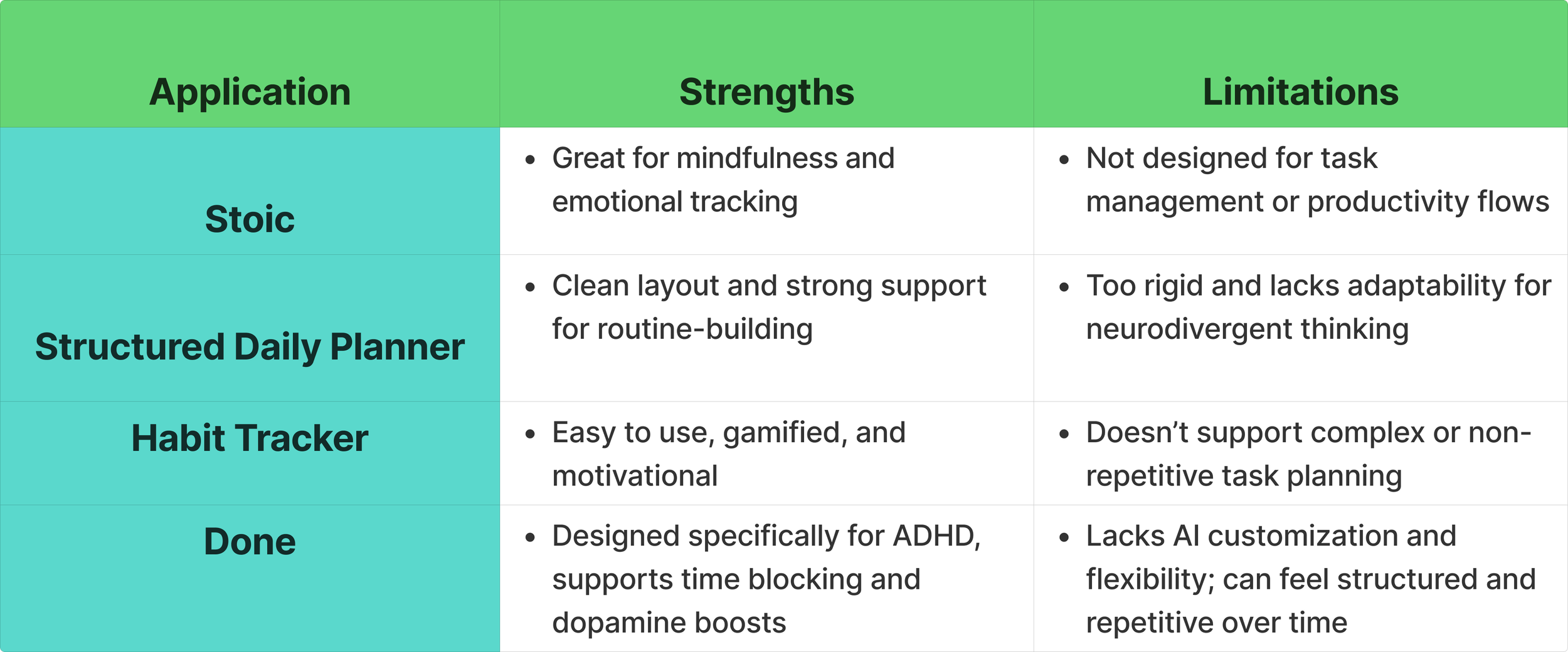
Some of the key competitors I analyzed included:
Stoic – for its mindfulness and emotional tracking features.
Structured Daily Planner – known for its clean visual layouts and focus on routine-building.
Habit Tracker – for its simplicity and gamification techniques.
Done – ADHD Planner & Focus Timer – Designed specifically for ADHD users, Done combines simple task planning with a built-in focus timer and visual progress tracking.
To better understand the competitive landscape, I also created a feature comparison matrix:

Competitor Summary:
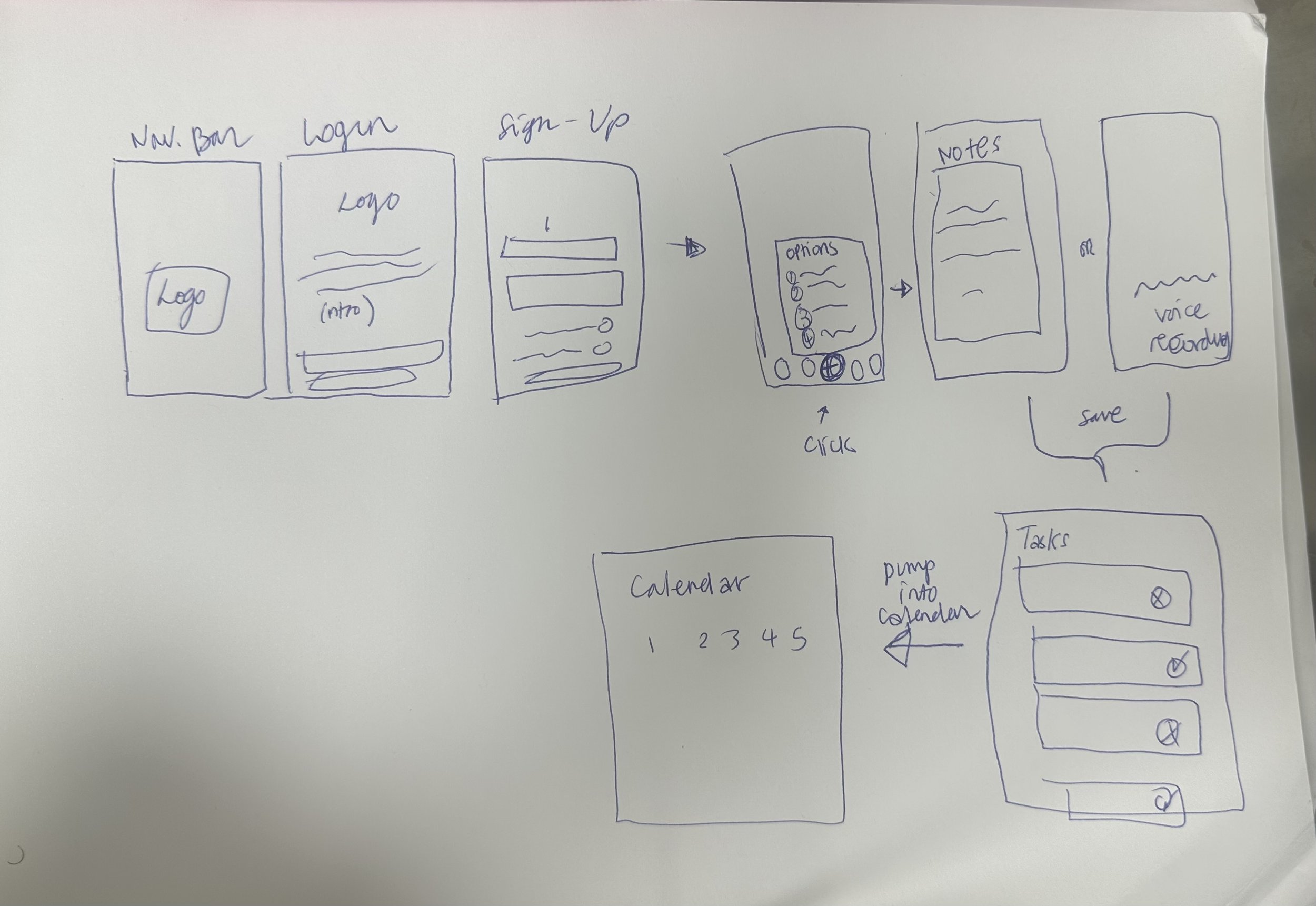
The design journey began with translating concepts into tangible ideas through sketches, allowing for creative exploration and rapid iteration. Grounded in user research and guided by personas, these sketches provided a visual framework that considered user needs and laid the groundwork for the subsequent designs.
Below are some initial ideas…
3. The Design Process
4. User Flow
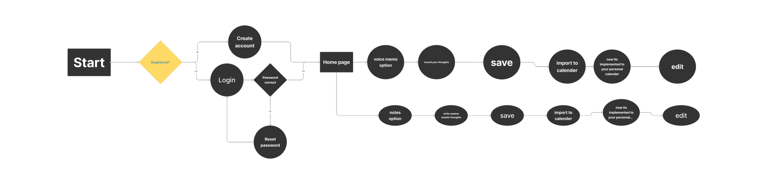
I aimed to create a user flow that is simple and straight to the point with an end goal of not over stimulating the end user.
5. Low-Fidelity Wireframes
For this early stage of the design process, I chose to develop only five low-fidelity wireframes, focusing on the essential screens required to illustrate the main user journey. Since my target audience includes neurodivergent individuals, it was especially important to avoid early visual noise or overstimulating elements.


With the five low-fidelity wireframes prepared, I conducted an initial round of usability testing to validate the core user flow before moving into more detailed design work. Since the product is intended for neurodivergent users, it was important for me to understand how intuitively they could navigate the interface
All sessions were conducted remotely via Zoom.
I intentionally avoided giving step-by-step instructions—instead, I provided a brief description of what the app is meant to do, then asked users to complete a set of simple tasks using their own interpretation of the interface.
6. User Testing

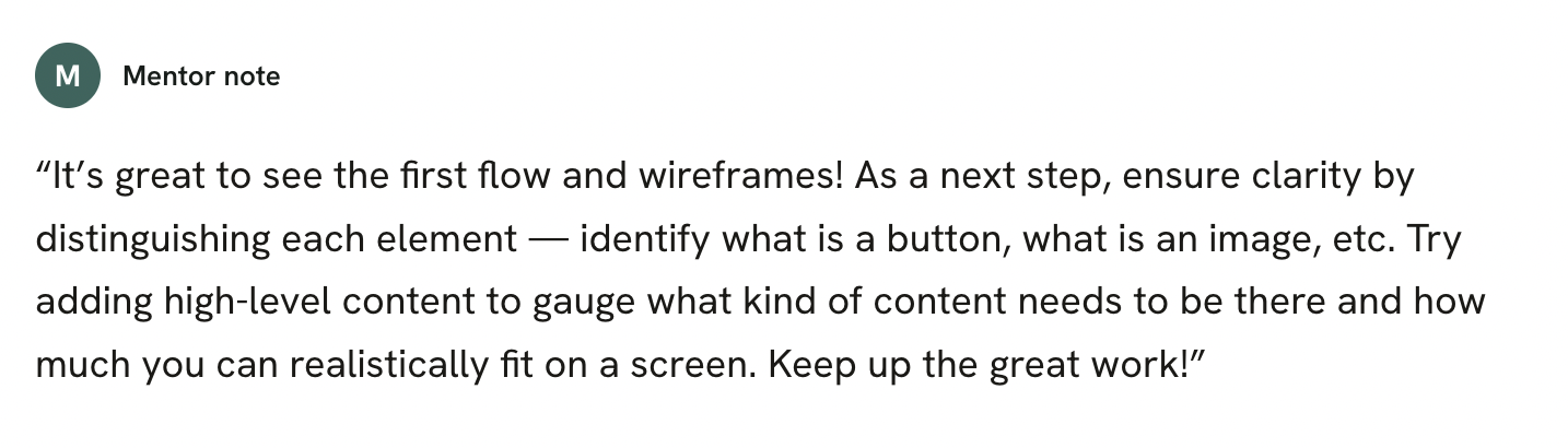
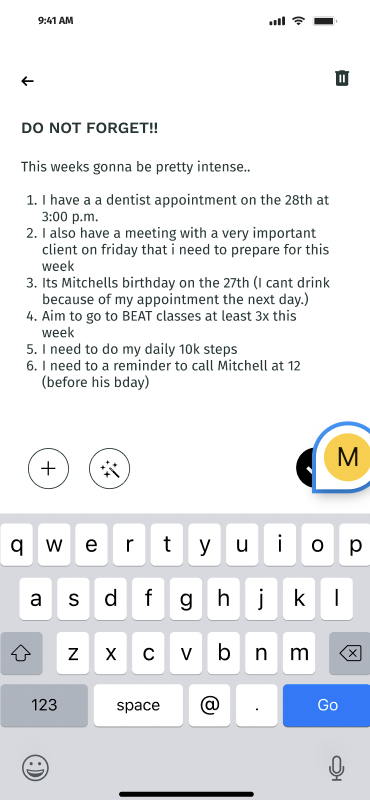
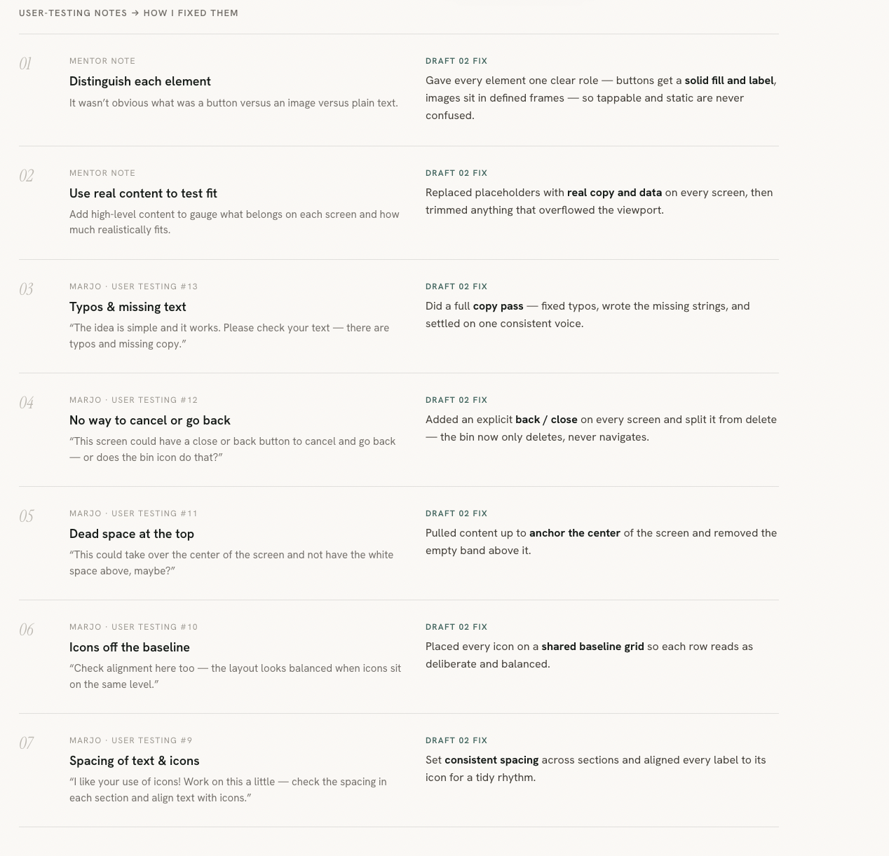
The first draft put the flow and wireframes in front of a mentor and a user-testing round. The notes converged on one theme — make every element legible: what’s a button, what’s an image, what fits on a screen, and how it all lines up.
7. Feedback & Iteration
8. The Design System
Pine
#34655D
Ink
#161C19
Mint
#CEEAD5
Sage
#5C8C86
Mist
#ECEEE9
Forest
#1E342E
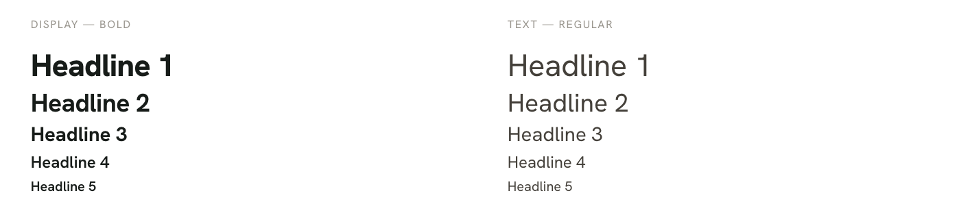
Typography
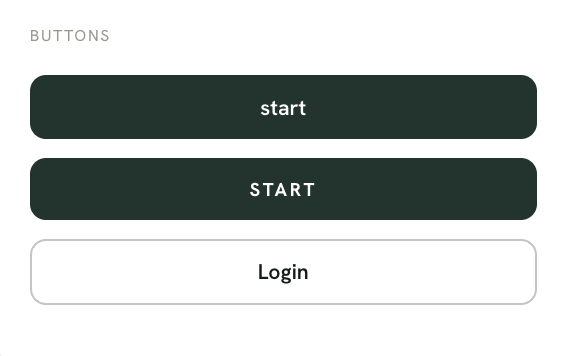
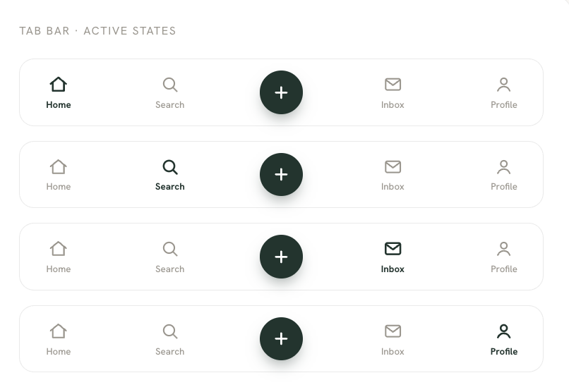
Components

9. The Final Design
After taking into condideration everything that has been discussed through either the interviews or simply mentor feedbacks… the final design is finally here!